TradeCraft Origin
consulting agency | www.tradecraftorigin.com
Cannabis Branding Project | Cannabis Logo Design | Cannabis Web Design
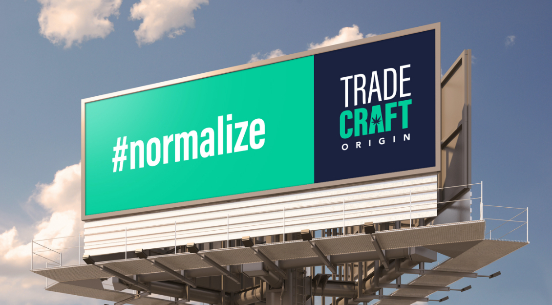
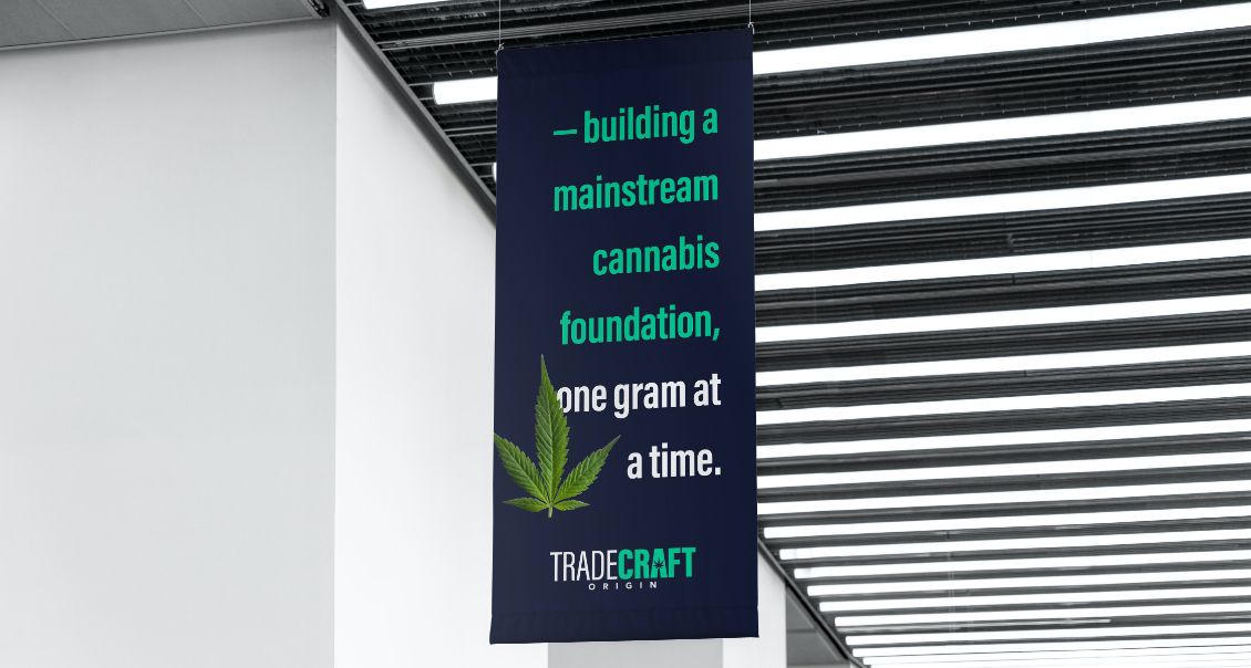
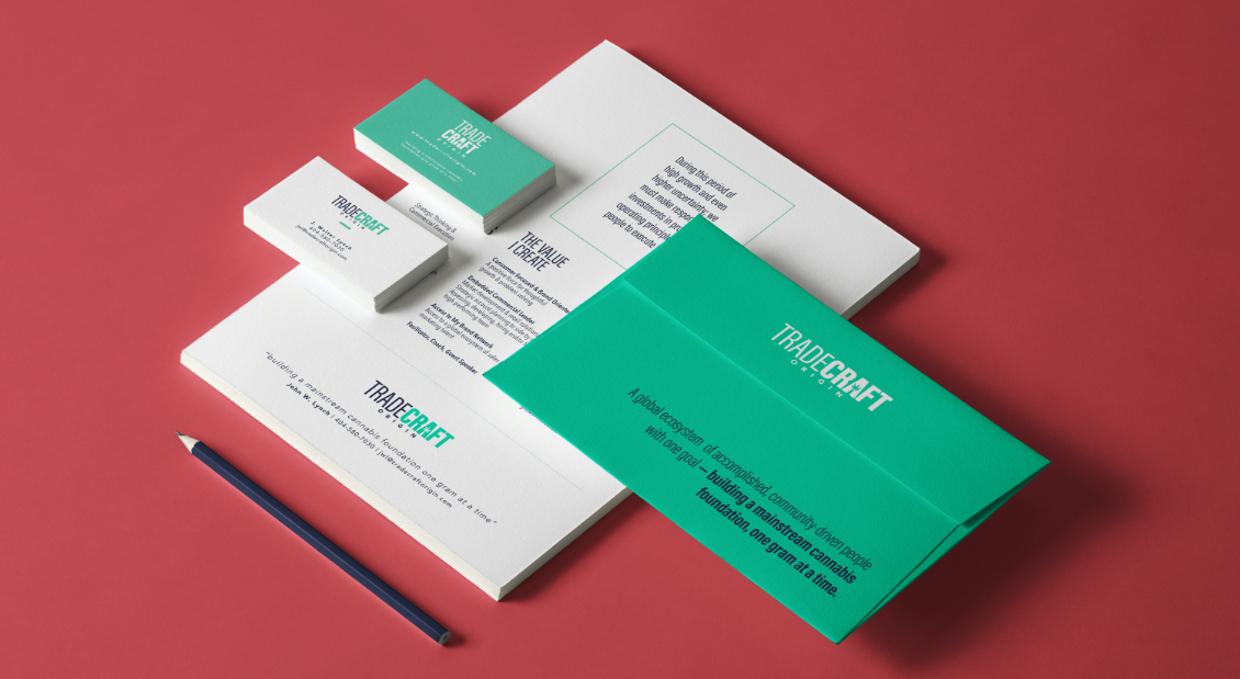
Cannabis is quickly becoming a mainstream industry, but for many business owners, it's still the Wild West. Trade Craft is all about fostering successful, meaningful connections between cannabis brands, retailers and consumers. With a name that nods subtly to both the industrial and artisanal roots of cannabis, Trade Craft's logo makes the implicit explicit with shades of green and the inclusion of a marijuana leaf.
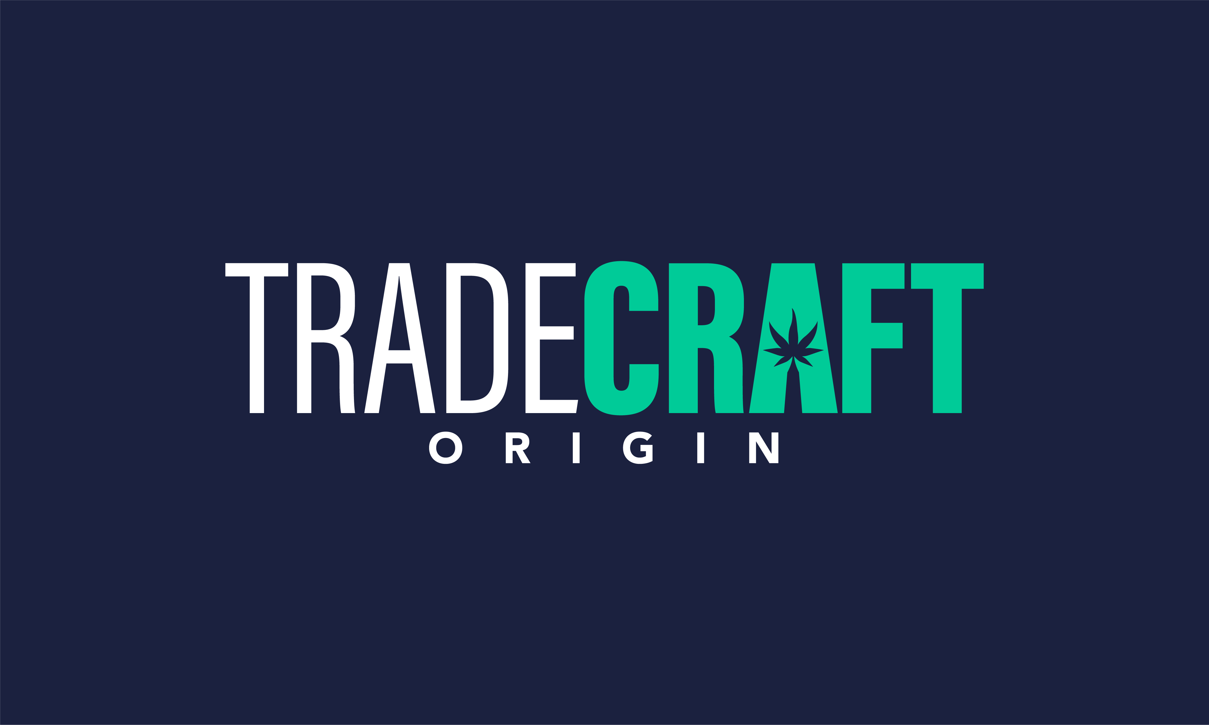

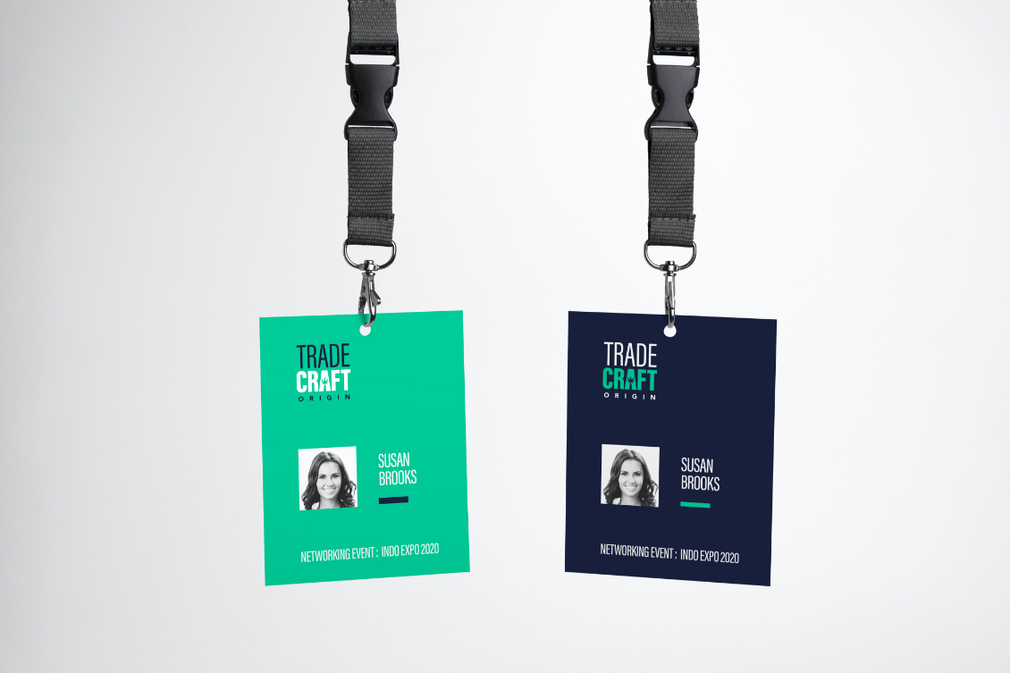
Trade Craft's branding uses a mint green rather than the forest or kelly greens typically employed by cannabis companies. The decorative "A" in the word "Craft" functions as a logo within a logo. Though the word mark is Trade Craft's primary logo, the branding is strong and distinctive enough for the "A" to represent the company on its own.
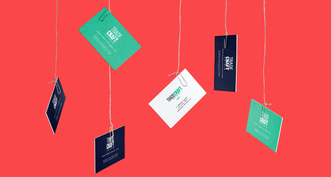
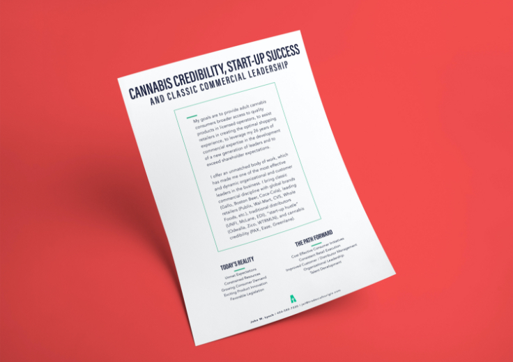
Much of Trade Craft's collateral material is B2B, so Resin Refinery chose bold, modern, sans serif fonts that function in a hierarchy that directs the reader's eye to the proper place each step of the way.
Trade Craft's mission statement is key to its business operation, so the phrase went right on the outside of their envelopes.
The Trade Craft website is designed to highlight the client's business bona fides and make it simple to contact him.